


I chose this album cover firstly because of my song choice which is on this song list and also because of the cover. It would be easy to re-create however using a man smoking, as this cover was, it could be criticised. I like how the title is on an angle with a white background making it stand out over the image.

This simple album from The Black Keys I found interesting because of the stand out image of the bird and the colour linked neat looking title. I think the cover has a unique look and would be relatively easy to recreate however I don’t feel making a similar album cover to this is right for my band and the image I’m trying to create.

This album cover stood out to me because of its bright colours and arty design, dissimilar to any of Kaiser Chiefs other album covers. The title 'medieval future relates to the background image and the Kaiser Chiefs logo standing out make the album identifiable.
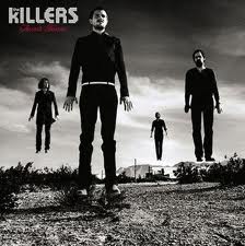
This is one of my favourite album covers by the Killers and I like the idea of have the band member floating. This would take time the recreate however I feel the effect the image is worth it. This would also be good for a new band as the audience would be able to see the band members, therefor making them identifiable in th future.

I like the look of this album cover because of its detailed design which relates to the title of the album. This would be hard to recreate as without professional looking art I don't think the cover would work.

This album cover stands out to most out of all the album covers I have chosen because of the vibrant colours. Also the album title relates to the image, being souvenir and a stick of rock being portrayed as the souvenir. Also the fact that is it open I feel portrays them offering it to the viewer. In this way offering the album for the viewer to buy. I also like the way the title is actually in the stick of rock which would be hard to recreate.

This is more of a simple album cover from the Kaiser Chiefs showing each band member with their faces clearly visible. This would work well with my album cover as I need to make my band identifiable to the target audience.

I like this album because of its unique look using a strong background image with the egg timer and patterns softened on top. Then showing the band name underneath in white making it stand out. I think the colours in this album covering the whole image make it different to most other albums. This would be easy to recreate however finding a strong enough background image would be difficult.
This album from Two Door Cinema Club is typical of their unique 'indie' album covers. I like how the title is linked with the image going through the models legs. This cover would be hard to recreate with such a complex image however the idea of the text I could take forward in my designs.

The cover from the Arctic Monkeys is more of a subdued, simple design. Again with the bands logo in the top left corner standing out on a black background makes the album identifiable. This would be easy to recreate however I feel is too simple for my target audience.

I like this album cover by the vaccines because of the way the image is sectioned of in the middle of the cover with the band name above it. I feel this looks good and would appeal to my target audience if I was to use a relative image in the middle.

This cover stands out for me because of the background image and monochrome colour scheme. However I think this only works because of the image which would be hard to recreate.

I like this album cover a lot because of the simple design combined with the colours in the oil pattern. This design would be easy to recreate and I think attract my target audience. I would however have to use text to make the album recognisable as the X as seen on this cover is associated with The xx.

This album cover by Pink Floyd called The Dark Side Of The Moon is one of Rock music's most iconic album covers. The refracting prism is used turning the single light into a number of different colours. This is one of the simple yet best design out of the ones I have chosen. This would be easy to recreate however the idea is already with Pink Floyd.
I like the top and bottom and the Killers one with them floating up. Some will be harder than others to recreate if you liked some of the concepts. what do YOU like about them, Harry?
ReplyDelete