
Friday 21 December 2012

Monday 10 December 2012
Saturday 8 December 2012
Finishing.

I have added this screen to the end of my music video, the pans on to the screen and then off again. This transition lasts for around 6 seconds. allowing the audience time to read the text making sure they know the website url.
I did this at the end of the video as it allows them to watch the video first to see if they like it or not, then seeing this at the end will make it more likely for them to go and visit the website.
I used capital gratis font which is shown in the videos watermarked production company logo as I think making this similarity adds professionalism and also more of an identity for the band.
Monday 3 December 2012
Finishing.

I have added this logo of my productions company as a water mark throughout my music video. This is to give the production company HCM Productions recognition and also because this follows the conventions of a music video in the Indie genre.
I have kept the text small and located in the bottom corner so that it does not restrict the audiences view of the music video but still stands out and is easily readable.
Wednesday 21 November 2012
Monday 19 November 2012
Advert.
I created an advert to help with the marketing of my video. Think releasing this before the release of the music video would help get peoples attention and hopefully watch the music video when it is released and therefore download the track. Using YouTube as a base point to spark interest then uploading the ad to social networking sights such as the Facebook page, Twitter e.t.c. Once people see the advert and start talking about it 'word of mouth' the sintered can quickly spread.
I think this advert works well with a small glimpse of the band done to interest the viewer. I have also added the website at the end of the video as this is the last thing they see, promoting them to go to the website when they have finished watching.
I think this advert works well with a small glimpse of the band done to interest the viewer. I have also added the website at the end of the video as this is the last thing they see, promoting them to go to the website when they have finished watching.
Friday 16 November 2012
YouTube Feedback.
This is some positive feedback I have be given on my first draft, showing me that people do like my music video. I also presuming these people are followers of the Arctic Monkeys and therefore would be my target market. Also with positive comments about the socks at 1:31 in the video.

Wednesday 14 November 2012
Mistake.
Whilst reviewing my draft video for mistakes I found this one at 2:09. It took a few looks over at this part of the song to see if it was a mistake but I realised that a double snare beat in the music was only shown as a single in the visuals. I will therefore re edit this part of the video for my final music video. Apart from this I didn’t manage to find anymore mistake after looking through thoroughly a number of times.
Tuesday 13 November 2012
Sunday 11 November 2012
Review.
A small review on how I think the day of filming went:
I think overall the day of filming the door jammers music video went well and was efficient in creating the perfect clips I need to create the video. I time I had was spend we in getting the shot I wanted filmed and I think the band and myself worked efficiently to get it all done in one day. Setting the location and mise en scene up did not take long and the whole band helped meaning it took no time at all.
Throughout the filming the band were co operative in listening and doing so I was able to get the exact shots I set out to get. They were enthusiastic which made the filming realist and more effective. Also having all of the equipment already there made it a lot easier not having to transport all the equipment.
The PA system worked well and allowed the band to keep in time with the song, which meant it was easy to sync the vocals and instruments with the song during editing. I also tried to film in chronological order going along with the song which also made editing easier as I was able to identify and find each clip.
I used a Nikon D3100 to film the music video. This ensured a HD quality for the music video which I felt was important to make it look professional and gave the door jammers a good image. I also use a Samyang fish eye lens to get a wide angle on some of the shots. I am happy with the end quality of the clips and think it improves the overall look of the filming a lot.
I also was able to use a tripod allowing me to get steady camera angles as well as panning and scattered movements.
Using my animatic during filming also help a lot as it told me exactly the shots I aimed to get for the best ending result. On the day I was able to change some of the shots to accompany the location.

Saturday 10 November 2012


Friday 9 November 2012


Thursday 8 November 2012
Wednesday 7 November 2012
Poster Development.
Development I made to my poster after the feedback I got from my teacher and peers:
Tuesday 6 November 2012


Monday 5 November 2012
Editing.
I am editing my video using iMovie on a MacBook. This software is easy to use and with previous practice I knew how to use the basic features. Ensuring I played the sound of the PA system out load during the performance made it a lot easier to sync the music and lyrics with the sound. I spend a lot of time going over the music video to ensure the syncing was correct.

Sunday 4 November 2012
Feedback.
This is some of the feedback I have received from the rest of my class. I will be using this feedback as well as the feedback from my teacher to improve my Digipak and Poster.
I uploaded three different versions of my digipak and have found that the majority of my class have chosen their favourite one and only given feedback on that. This has helped me decide which Digipak I will be improving.
Saturday 3 November 2012
Filming.
Just at the filming location in Hinckley doing my opening shot of the drums. I gave the band some time to practise through the whole first to warm up. Hopefully the day goes well...

Filming day.
Today is the day I will be filming my music video. I plan to get to the location in Hinckley for 11 o'clock giving me more than enough time to film all of my shots in 4 hours recording time which ends at 3. At 11 the whole band will be there ready to start filming so it will just take setting up the camera when I get there. Changing some bits of the mise en scene in each shot I can do as I go a lot however I want to keep each shot as authentic as possible and realist for a new band. I also plan to look through all of the clips tonight making sure they are all as I want them before I start editing. I will be taking a hard copy of my animatic to the recording.
Friday 2 November 2012
Night before tomorrow.
Tomorrow I will be filming for my music video. I have my animatic and camera ready to take. This is all I will need as the instruments, amps e.t.c are already at the location in Hinckley.


Thursday 1 November 2012
Feedback.
Digipak Level 3 7 / 10
I have marked the one with primary colour letters and circles design.
Mr Smith likes the plain white one
WWW
Nice use of font and colour. Like image of band. Neat and clean feel (primary colours version).
EBI
Make THE all one word as there seems to be a space between t and h(primary colours version). Could poster link to digipak, as very different font and colours?
Legal jargon missing from all digi pacs. This MUST be included. Reduce size of font for website
If you’re going to have plane panels you MUST explain in your R&P why you made that decision
Poster Level 2 6 /10
WWW
Neat, clean feel, minimalist as some bands in your genre are.
EBI
NME DON’T do star ratings, they do scores out of 10
Change font for stars to a more solid and plain design
Think about poster and CD continuity across products.
Reconsider font size for web and label, currently too large
Wednesday 31 October 2012
Peer assessment.
I created a word document and gave the rest of my group peer assessment on their digipaks and posters. I gave then guidance on what I though went well (WWW: What Went Well) and also what I thought they could do to improve their designs (EBI: Even Better If). I also will be receiving feedback for my draft digipak and poster on how I would be able to improve it. This will be helpful as the age’s group of my class is within my target market.
Sunday 28 October 2012
Changes.
I have had to change my filming schedule and times due to unavailability of the whole band. I therefore will now be filming on Saturday 3rd November. The location will stay the same and also the weather forecast looks promising meaning I will be able to film all of the intended shots in one day.

Friday 26 October 2012
New Animatic.
This is the new animatic I have created for my music video due to the fact I decided to change it to completely performance throughout.
Tuesday 23 October 2012
Performance&Narrative?
Thinking about my music video and talking about it with members of my class and other people in my target audience I have decided to make my music video and performance. Therefore I will be using one location with a total focus on the band and them playing. I think this is more appropriate for a new band and a first music video release. It will attract my target audience as they will be interested to see the band playing much the same as they are interested in going to see bands live.
This will allow the audience to see each band member up close without the distraction of a narrative, which through my market research I have found would attract them more for a new band rather than a performance and narrative. Also this will make filming easier without have to worry to much about weather forecasts as I will be able to film all inside.
I will therefore be creating a new animatic.
Sunday 21 October 2012
Location.
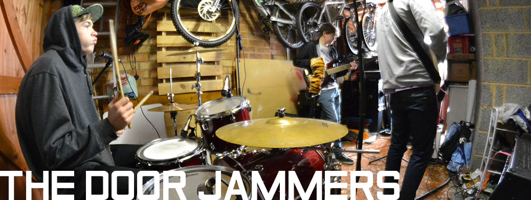
I have chosen the location on a 'garage' environment for the filming of my music video. I think this will give it a rustic feel which is one that I want to portray for the door jammers. I also think doing the video in this location relates to a new band who can't afford a nice new music studio to film in but instead use what they have. I also think this will relate to the audience. With the clustered look, cable scattered around the floor, will at to the garage band theme I want to portray.
I will be able to use this room for free and will be using a p.a. system for the sound. The instruments will be brought by the band.
This is a photo of the location and also the band:

Saturday 20 October 2012
New Identity.

I will be using this font on the digipak and poster helping relate the two. I will also be able to use the font through parts of the video as this will be where the audience gets to see the band members and therefore in theory make a link between the band and the images/text they see.
Friday 19 October 2012


Wednesday 17 October 2012
Friday 12 October 2012
Risk Assessment.

Filming schedule.
My planed days to film are between Monday 15th October and Sunday 21st October. I will decide nearer the time which days I will be film exterior shots depending on the weather forecast. The interior shots I will be able to film on any day providing I have the entire band available. If this is not the case then I will be able to film the shots with the band member I have available to use my time efficiently.
Thursday 11 October 2012
Equipment and props.
The equipment such as the guitar, drums and mic will be provided by the band members and they will be able to bring their own. Also the costumes will be provided by the band members as guided by myself. As far as lighting and effects these will be brought by myself to the session room. Finally the camera will also be brought by me and will only be used by me.
Wednesday 10 October 2012
First album cover drafts.

This first album cover I made I wanted to be the most simplistic and simplistic. I chose to use no colour and just the 'drawing' look font for the album text. I wanted to see what this sort of design would look like and if I think it would be suitable for the door jammers. I liked this design but thing it would stand out enough on the shelf which would be important for a new band.

For my second draft front cover design I choice to try a full colour pallete look, starting with red and ending again with red at the end. I added a box bellow the text at first by mistake but though it worked well and gave the album cover a more intresting look. I think this cover would stand out on the shelves however I do not feel it relates to the door jammers style.

For this album cover design I chose to use a different font which I felt worked well. I didnt want to create another plain album cover so I added a background behind the text to make it more intresting. I like the look of this cover but still think it could be inproved to stand out furthure on the shelve again its competition.

This album cover draft design I a lot different from the others and idea I wanted to try. I dont think this design worked and would not fit in with the door jammers style. I also don't like the backround being grey.

This album cover I think works well. I think the colour design within the letters looks good and could work as an album cover for the door jammers. I also think it would attract my target audience and stay out on the shelves as a minimalist yet intresting design.

This final front cover draft design I chose to just change the position into the bottom left hand corner of the page which I beleive looks a lot better. The only problem I can see with this design is being on the shelf with out cd's the name might be hiden being at the bottom.
Monday 8 October 2012
The font.


Sunday 7 October 2012
Song list.
This is the song list I will be using for the back cover of my digipak showing the audience which songs are featured on the CD and indicate which track number they will be;
1. Fake Tales Of San Francisco2. Still Take You Home
3. View From The Afternoon
4. Brianstorm
5. When The Sun Goes Down
6. Leave Before The Lights Come Up
7. From Ritz To The Rubble
8. I Bet You Look Good On The Dancefloor
9. Flourescent Adolescent
10. Mardy Bum
I have chosen to use ten songs that are previous Arctic Monkeys song. I think this makes the album look more realistic and original rather than creating new song names. Having ten songs relates to the conventions of most albums similar to mine. Also I have made Fake Tales Of San Francisco the first song on the track list.
Friday 5 October 2012


Subscribe to:
Posts (Atom)