
Saturday, 29 September 2012

Thursday, 27 September 2012
Album cover inspiration.


I chose this album cover firstly because of my song choice which is on this song list and also because of the cover. It would be easy to re-create however using a man smoking, as this cover was, it could be criticised. I like how the title is on an angle with a white background making it stand out over the image.

This simple album from The Black Keys I found interesting because of the stand out image of the bird and the colour linked neat looking title. I think the cover has a unique look and would be relatively easy to recreate however I don’t feel making a similar album cover to this is right for my band and the image I’m trying to create.

This album cover stood out to me because of its bright colours and arty design, dissimilar to any of Kaiser Chiefs other album covers. The title 'medieval future relates to the background image and the Kaiser Chiefs logo standing out make the album identifiable.
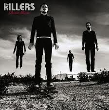
This is one of my favourite album covers by the Killers and I like the idea of have the band member floating. This would take time the recreate however I feel the effect the image is worth it. This would also be good for a new band as the audience would be able to see the band members, therefor making them identifiable in th future.

I like the look of this album cover because of its detailed design which relates to the title of the album. This would be hard to recreate as without professional looking art I don't think the cover would work.

This album cover stands out to most out of all the album covers I have chosen because of the vibrant colours. Also the album title relates to the image, being souvenir and a stick of rock being portrayed as the souvenir. Also the fact that is it open I feel portrays them offering it to the viewer. In this way offering the album for the viewer to buy. I also like the way the title is actually in the stick of rock which would be hard to recreate.

This is more of a simple album cover from the Kaiser Chiefs showing each band member with their faces clearly visible. This would work well with my album cover as I need to make my band identifiable to the target audience.

I like this album because of its unique look using a strong background image with the egg timer and patterns softened on top. Then showing the band name underneath in white making it stand out. I think the colours in this album covering the whole image make it different to most other albums. This would be easy to recreate however finding a strong enough background image would be difficult.

This album from Two Door Cinema Club is typical of their unique 'indie' album covers. I like how the title is linked with the image going through the models legs. This cover would be hard to recreate with such a complex image however the idea of the text I could take forward in my designs.

The cover from the Arctic Monkeys is more of a subdued, simple design. Again with the bands logo in the top left corner standing out on a black background makes the album identifiable. This would be easy to recreate however I feel is too simple for my target audience.

I like this album cover by the vaccines because of the way the image is sectioned of in the middle of the cover with the band name above it. I feel this looks good and would appeal to my target audience if I was to use a relative image in the middle.

This cover stands out for me because of the background image and monochrome colour scheme. However I think this only works because of the image which would be hard to recreate.

I like this album cover a lot because of the simple design combined with the colours in the oil pattern. This design would be easy to recreate and I think attract my target audience. I would however have to use text to make the album recognisable as the X as seen on this cover is associated with The xx.

This album cover by Pink Floyd called The Dark Side Of The Moon is one of Rock music's most iconic album covers. The refracting prism is used turning the single light into a number of different colours. This is one of the simple yet best design out of the ones I have chosen. This would be easy to recreate however the idea is already with Pink Floyd.
Wednesday, 26 September 2012
The digipack.
Digipacks usually included some or all of the following aspects:
Front - Recognition of the band for the buyer, could be a logo, the band name or an identifiable object that relates to the band or artist.
Spine - Gives the digipack recognition of only the side is visible when being stacked in a certain way.
Back - usually contain the song names.
Membership postcard/flier - gives the buyer more for their money and could inform them and be used as advertisement.
Lyric section - Usually in a seperate booklet a lyric section gives the buyer a different desirable factor.
Disk impression - needed to hold the disc to prtect it from damage. Usually on the right in a four side digipack or in the middle in a six side digipack.
Band info section/booklet - gives the buy more to look at and also gives the band/artist to inform its target market directly.
Free image/poster - gives the buyer more for their money increasing there satisfaction. Also increases the chance of them buying the digipack ranther that dowloading the album.

Tuesday, 25 September 2012
Monday, 24 September 2012
Location.
The location for filming will be in a range of places. For all of the performance shot I will be using a house garage. The location of this will be in Hinckley, Leicester. I will be traveling via car to get to this location. I think this will give a 'new band' environment and one which the audience will be able to relate too. I want to portray an up and coming band that are starting from the basic room set. A band they cant currently affort a nice posh recording studio but instead use what they have available with no real design to the room. I think this will bring a focus on the band members. Also this brings the costs of the production down as I will be able to use the room for free instead of a costly practise room or studio.
Using all the bands own equipment will give us more freedom. I will be able to create the garage band scene with amps and cable scattered around the room. With the simple mise en scene of the garage making the band and the instuments stand out will work well and be an authentic was of portraying in the band.
I will focus on different shots within the music video to bring even more of a focus of the band members and instruments using a variety of different shots and filming methods. I want to use mostley moving shots within the video to keep it instresting for the viewer meaning there is always something happening within the shots, but contrast this with a few still shots throughout.
I will focus on different shots within the music video to bring even more of a focus of the band members and instruments using a variety of different shots and filming methods. I want to use mostley moving shots within the video to keep it instresting for the viewer meaning there is always something happening within the shots, but contrast this with a few still shots throughout.
Sunday, 23 September 2012
About Animatics.
(Animatic)
An animatic is simply your storyboard in video form, the purpose of an animatic is to allow you to judge how effective your video is prior to filming and it allows you to identify sequences which might not work and whether your editing is quick enough.
(Finished video)
Saturday, 22 September 2012
Video overview.
My music video is both peformance and narraticve based. The performance will be important, especially for a new band, to allow the audience to see each band member. Close ups of the band will give the audience recognition of how they look. Most of the close ups will be of the lead singer as he is the star image. My music video will switch between the narratives and performance throughout and the clips will be short and fast.
I will use mainly amplification and illustation in my music video. I think this is important because my target audience are intrested in the instruments as well the lyrics. The band will also be used in the narative parts of my video. They will be shown in normal life outside of the performance. I have found this also intrests the audience as they enjoy getting to see what the artists are like when they are not performing and feel they are getting an insight into there lifes.
I will use a range of different shots such as high angle, low angle, panning e.t.c. to keep the audience intrested. Close ups of the lead singer will amplify the lyrics and close ups of the drums and guitars will amplify the music. I will also use scenes such as the San Fransisco sign to illustrate the lyrics.
I will use mainly amplification and illustation in my music video. I think this is important because my target audience are intrested in the instruments as well the lyrics. The band will also be used in the narative parts of my video. They will be shown in normal life outside of the performance. I have found this also intrests the audience as they enjoy getting to see what the artists are like when they are not performing and feel they are getting an insight into there lifes.
I will use a range of different shots such as high angle, low angle, panning e.t.c. to keep the audience intrested. Close ups of the lead singer will amplify the lyrics and close ups of the drums and guitars will amplify the music. I will also use scenes such as the San Fransisco sign to illustrate the lyrics.
Subscribe to:
Posts (Atom)